Aretha Franklin: Editorial Content Hub
At Rolling Stone, we partnered with Nat Geo to create a sponsored editorial content hub about all things Aretha to coincide with the release of their limited series, Genius: Aretha. We had also recently signed up for the front-end web development platform Ceros, and this was the perfect project to pilot this new design program with. Previously our content hubs were all built within our CMS, using simple existing building blocks and a content tag. However Ceros would allow us to create a highly custom, interactive microsite experience for our readers. In Ceros, I'd be able to have full build control over all animations, functionality, and interactivity. If successful, this new way of building content could become a staple product offering for the company moving forward.
MY ROLE Solo lead designer, Information architecture, New product development
THE TEAM Product Manager, Engineer, Creative Director, Editor/Copywriter, Photo Researchers
THE GOAL
The final scope of work that was sold promised the client all of the bells and whistles we had to offer - photo galleries, audio components, playlist embeds, existing and new written content, and more. Once we had the official brief, the editor, editorial creative director, and I began brainstorming how we could best incorporate all of these requested components while still telling a compelling editorial story. I suggested the idea that an interactive timeline, telling the story of Aretha's legacy decade by decade, would be the best user experience.

After being onboarded to Ceros and attending in-depth trainings on the platform, the next step was to figure out the best way to implement the experience into our site. This took building a few test pages and collaborating with product management and dev to come up with a new template in CMS that would allow us to import a host of different experience formats, while still allowing us to traffic clients' ads as needed and to be able to gather metrics.
First Steps
PRELIMINARY WIREFRAMING
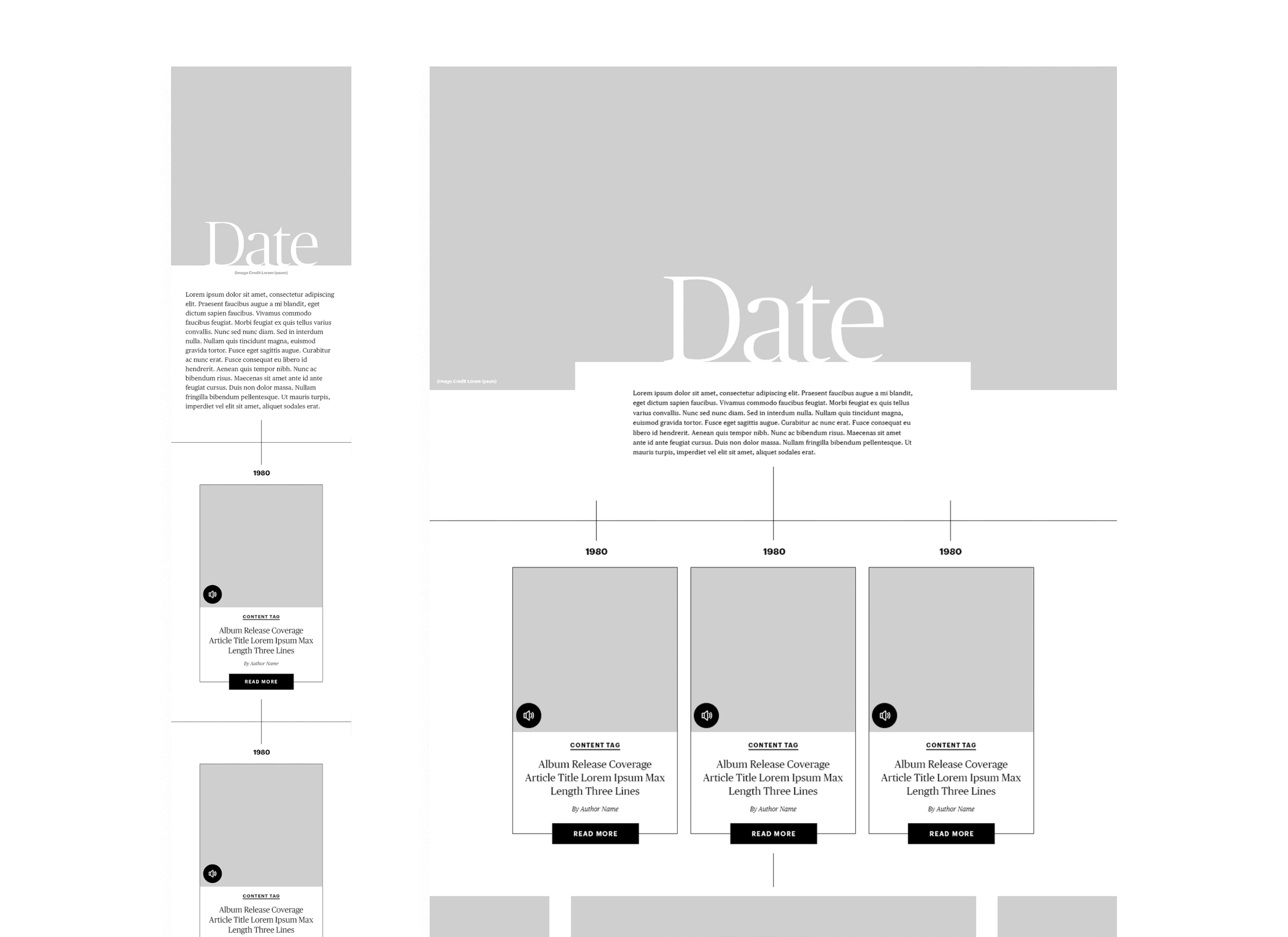
Since this was our first project of this scope, we needed to develop a way for us all to be on the same page of how this project was going to come together. I decided to come up with a few low-fi wireframes of how I envisioned everything could be laid out in order to give the editor and photo team a clearer idea of what was needed from them. From there, the editor began pulling relevant Rolling Stone articles, audio book clips, and started writing new content for each section to my requested word count. Then I got to work with the photo team to research and pull the best photos for each decade.

FROM LOW-FI TO HIGH FIDELITY
Once we had amassed all of our content, I began thinking through the information architecture, grouping content and finding similarities in each section that could serve as building blocks. It was important to come up with repeatable formats that could be used throughout each section to create visual consistency. I began developing a library of different modules that would serve our editorial storytelling and our clients’ goals, editing my original low-fi wireframes as I went. Once I had approval internally on the structure, I began turning my wireframes into a high-fidelity mockup, as seen below.
The Build: A Closer Look
The Albums
THE PROBLEM
Feature each of Aretha's albums including written Rolling Stone coverage of the album as well as an embed of the album from Spotify.
THE SOLUTION
Originally these were two separate asks - during the information architecture phase I decided that there was significant enough overlap in order to combine these elements into one single solution. First, I wanted to tie in the timeline concept further and reference our established editorial look by pulling in a dashed line element up top which is frequently used in the print magazine. I then created modules that would look visually consistent with the article blocks that not only drive out to content but also house a click-reveal of the corresponding Spotify playlist. I chose this user flow in order to use space more efficiently and also to keep everything looking as cohesive as possible since we had no control over the UI of the embeds that were being generated directly from Spotify.
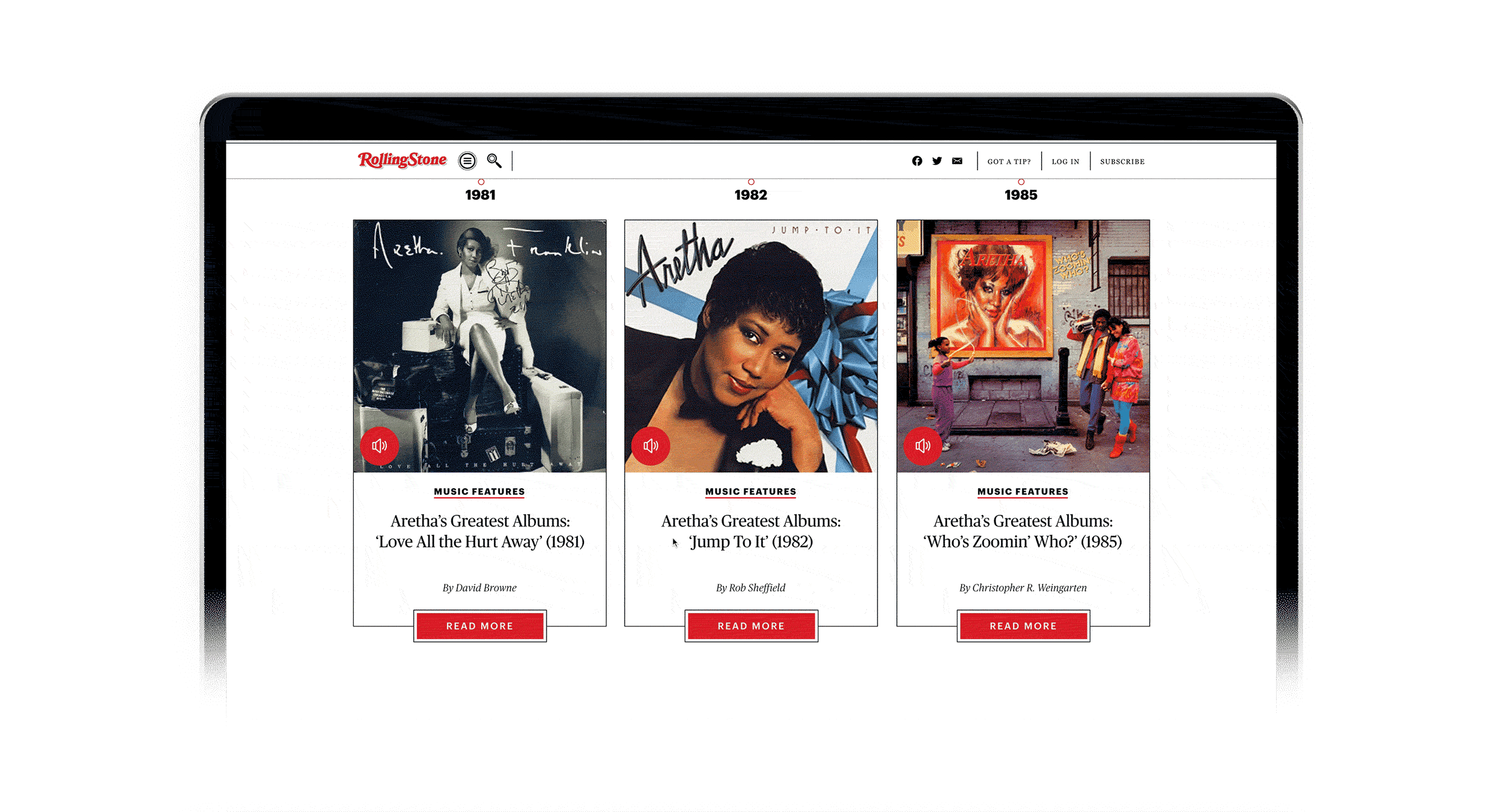

The Article Modules
THE PROBLEM
Create a module that features the the article category, title, author, main image, and a click-out functionality.
THE SOLUTION
I created a clear typographic hierarchy while bringing our preferred print fonts into web for the first time. I outlined each article module in the same thin black timeline motif used throughout the experience. I made sure to account for all title lengths so that each module would be the same fixed height.

The Audiobook Excerpts
THE PROBLEM
Create a functionality where the users can play clips from Rolling Stone-backed audiobook, The Queen: Aretha Franklin.
THE SOLUTION
I decided that the best way to represent these audio clips visually was to create a pull quote module with a CTA that doubles as a play/pause button to listen to the full excerpt. This feature required a lot of trial and error using event tags in Ceros's SDK panel.
The Galleries
THE PROBLEM
Create an interactive gallery that can house both vertical and horizontal images so that we won't be limited to one format or the other, allowing us to use all of our preferred photography.
THE SOLUTION
Within the grid system of the microsite, many of the elements are inset. However for photography moments, such as in the galleries and section headers, I wanted to take up as much screen space as possible to not only visually break up the page but also to give these images their moment to shine. I did this by taking up as much vertical space as the screen would allow while making sure that the toggle buttons would still be visible above the fold, and by reducing opacity of the left and right images which encourages users to click through the additional photos. This format also allowed me to toggle between horizontal and vertical photos seamlessly without creating jarring alignment changes.

The success of this pilot project and the new workflows we'd established allowed us to pitch and sell this type of product offering moving forward, creating a new revenue stream for the company. It didn't just impact the revenue org though, it also served as the foundation for the editorial team to put together similar executions for their content tentpoles. Many elements from this design were adapted into a component library that led to far greater efficiency in creating future content hubs, allowing us to scale rapidly.
